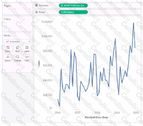
You have the following visualization.
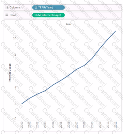
You need to show how Internet Usage values change from year-to-year as a percentage. Which quick table calculation should you apply to the Internet Usage field?
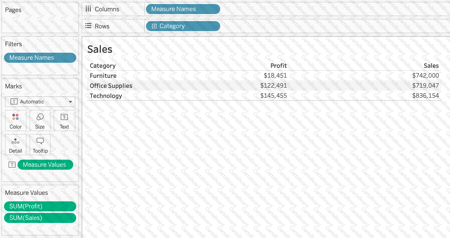
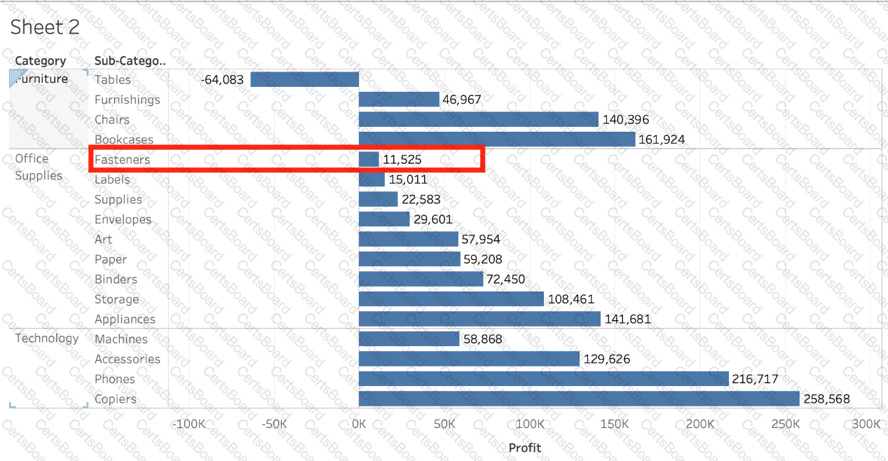
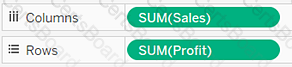
You have the following visualization.
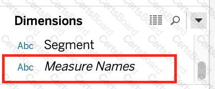
Where should you place a field named Region to show multiple distinct lines on the same axis?
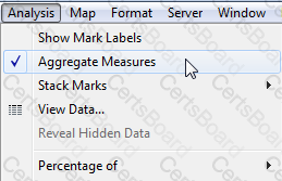
True or False: We can disaggregate the data, to see all of the marks in the view at the most detailed level of granularity
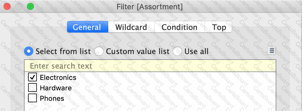
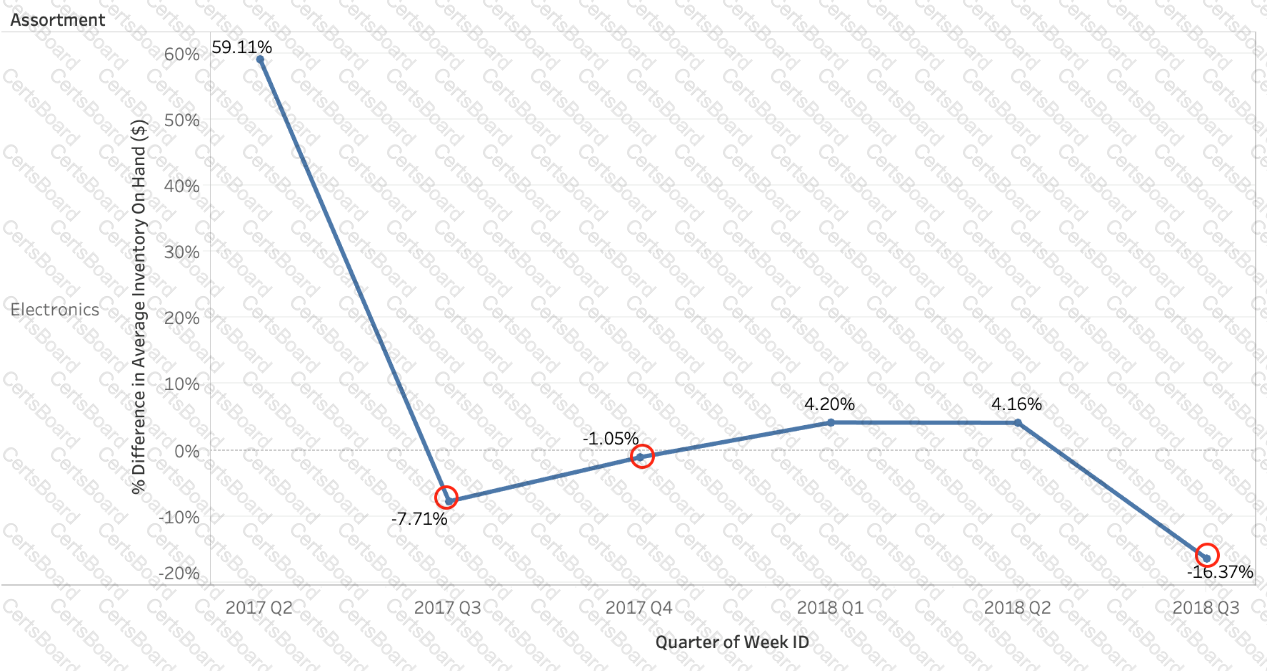
Using the Time Series table, create a chart that shows the percent difference in Average Inventory on Hand for each Assortment by year and quarter.
How many quarters did the Electronics Assortment show a negative percent difference in the Average Inventory On Hand?


TESTED 02 Apr 2025
 Graphical user interface, text, application, email
Description automatically generated
Graphical user interface, text, application, email
Description automatically generated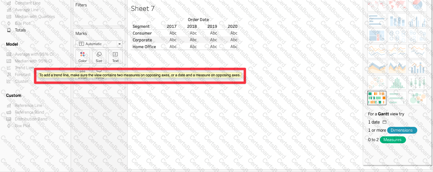 Graphical user interface, application
Description automatically generated
Graphical user interface, application
Description automatically generated
 ( Simple Scatter Plot)
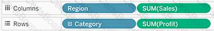 (Matrix of Scatter Plots)