Explanation: **IMPORTANT QUESTION AND EXPLANATION, PLEASE READ**
3 ways to group data -
1) Marks
2) Labels
3) Dimensions shelf.
*IMPORTANT*
If we Group the data by selecting the marks, then they remain separate marks in the view and then have the same colour. Also, a new group is created in the Dimensions shelf. Example -
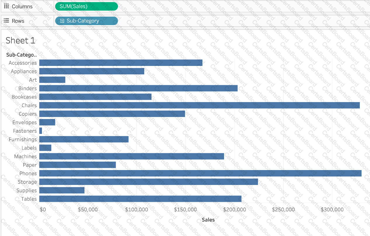
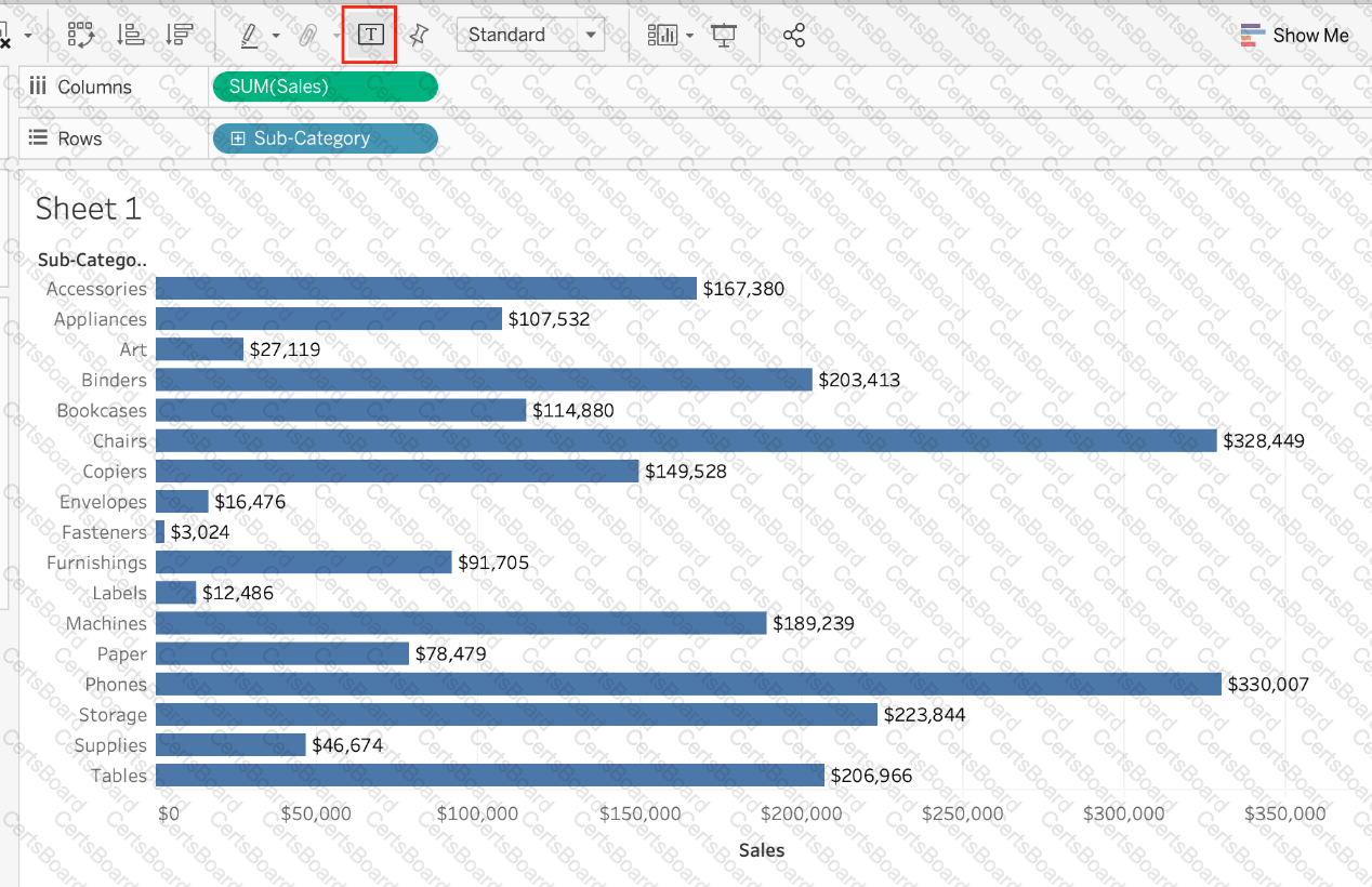
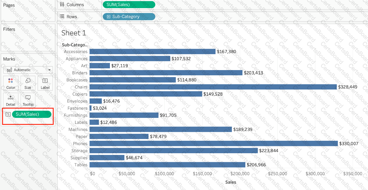
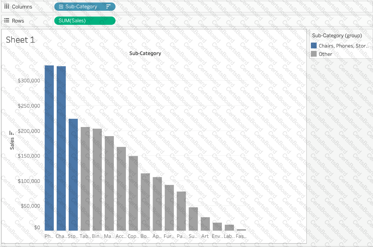
Using the sample superstore dataset, first plot a bar chart showing sales for each sub-category:
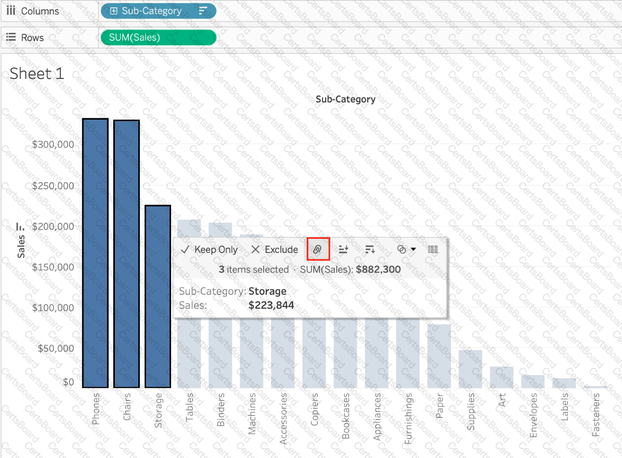
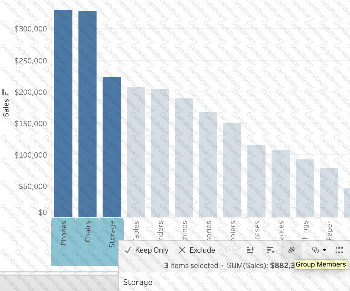
Here, if we Select Phones, Chairs and Storage by selecting the MARKS (Bars), and then group them:
They remain seperate marks (BARS) but are grouped by the same colour.
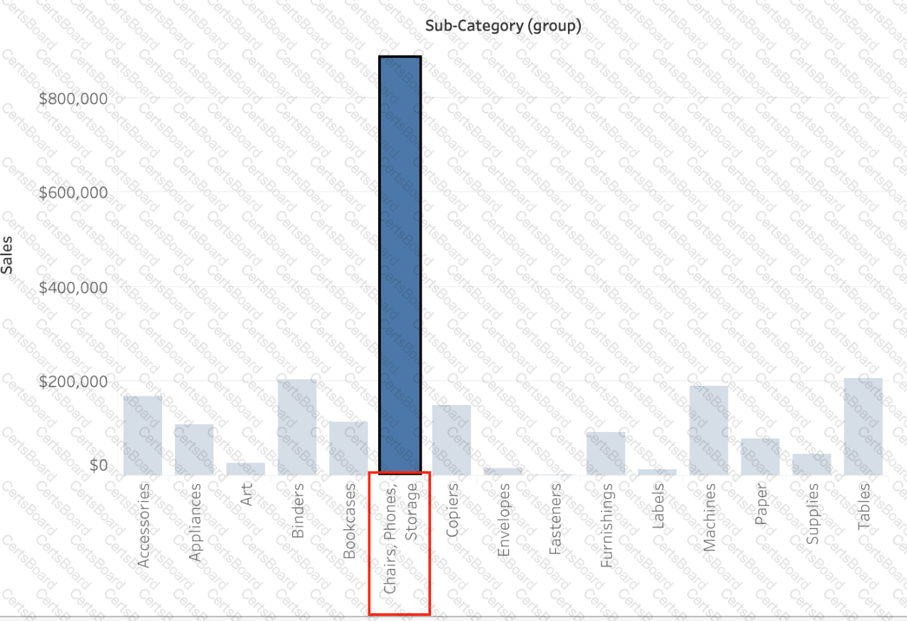
Now, if we didn't do this, and rather grouped by selecting their Labels (Names):
Then they no longer remain separate Marks (bars) but are rather consolidated into a single Bar:
Finally, we can group directly from the Dimensions shelf as follows:
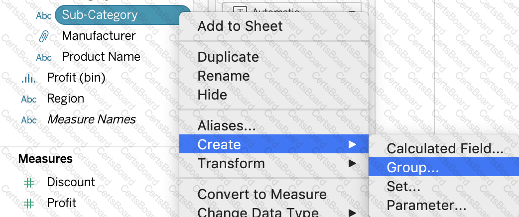
Now choose Phones, Chairs and Storage and Click Group:
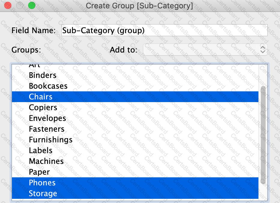
You will now automatically have a new Dimension as follows: