A business analyst needs to create a visualization that compares two measures over time using a continuous scale that includes a range. The measures will be Profit and Revenue.
Which visualization should the business analyst use?
A business analyst is creating an app that contains a bar chart showing the top-selling product categories. The users must be able to control the number of product categories shown.
Which action should the business analyst take?
A business analyst needs to rapidly prototype an application design for a prospective customer. The only dataset provided by the customer contains 30 fields, but has over one billion rows. It will take too long to keep loading in its entirety while the analyst develops the data model.
Which action should the business analyst complete in the Data manager?
A business analyst is creating an app using a dataset from ServiceNow. The dataset shows information about support cases, including how many days it has been since the case was opened (age).
The app requirements are:
• The dashboard must display support cases in categories based on the age (New, Aging, and Beyond Service Level Agreement)
• The categories will be used multiple times in the dashboard
• Given the volume of support cases, it is expected that the dataset will grow to be very large
Which solution is the most efficient way for the business analyst to create this app?
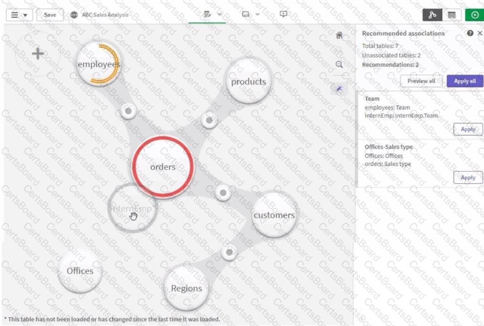
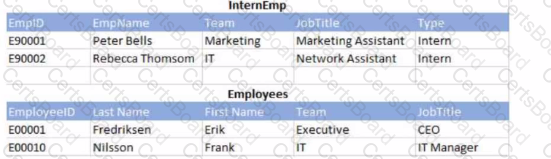
Refer to the exhibits.
A business analyst must add a list of temporary employees (interns) to the current sales app. The app contains an existing employees table. When the business analyst profiles the data, the association view displays possible associations as shown.
Which action should the business analyst take in Data manager to meet the requirements?
A banking organization needs a dashboard that shows the following:
• A KPI indicator for current year (CY) versus last year (LY) revenue
• A scatter plot that shows the cost versus revenue of product categories
• A treemap that shows average customer satisfaction rating based on regions
• A table that shows CY cost by record number, financial instrument, and bank
In addition to the customer satisfaction rating, which fields should be used to create the required measures?
A dashboard developer finishes creating a supply chain analysis app and is presenting it to leadership for review. The landing page shows four visualizations including:
• Bar chart showing available supply by product category
• Line chart showing total cost of deliveries to the warehouse by month-year
• Scatter plot showing cost of delivery and time-to-deliver by product
• A map that shows the volume of delivery from suppliers to warehouses using a line layer
Leadership asks the developer how they can see the total cost of delivery overall. How can the analyst show this information to leadership?
A business analyst is developing an app that contains a data model with fields: Country, City, Sales, ProductName, and ProductCategory. The global sales manager wants to add new visualizations to this app.
The business analyst must include the following:
• Ability to dynamically change the number of countries and cities
• Display a maximum of 10 countries
• Display a maximum of 5 cities per country
Which steps should the business analyst take?
A business analyst created a visualization that has a color indicator when an order is below a certain fixed profit threshold. This visualization now needs to change so that the threshold can be defined by the user. The user base is approximately 1000 heavy Excel users. These thresholds will be defined by each user somewhat frequently, although the data changes only once per day.
Which action should the business analyst take to update this visualization?
A customer needs to demonstrate the value of sales for each month of the year with a rolling 3-month summary. Which visualization should the business analyst recommend to meet the customer's needs?


TESTED 14 Mar 2026